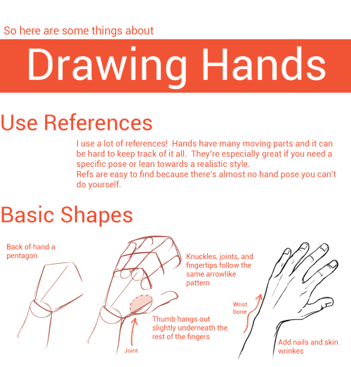
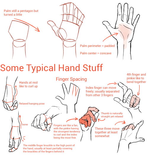
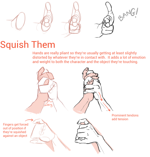
Tuesday Tips - Handling Objects — To Show A Character Handling An Object, Think Of Merging The Hand

Tuesday Tips - Handling Objects — To show a character handling an object, think of merging the hand and object into one simple shape. Think of how you would wrap your fingers around it and how you would use it. Function is key! Norm #100tuesdaytipsvol2 #grizandnorm #handlingobjects #arttips #arttutorial
More Posts from Arttuti and Others


Your art is so good !!! How do you color the skin its soo smooth
Thank you very much Anon ( ̄ε ̄@)hehehe!!Well I have some shots of one of my recent drawings so I’ll try to explain it a little bit hhahahah


Basically what I do is: 1. Put on base color2. Add some light shadows (They don’t even have to look very smooth, like the images above) 3. Then I start adding some darker shades of color and different skin tones to give it the correct shape, at this point I start adding some brighter tones, so yeah, they usually look very messy at this point. My brushstrokes also look like crosses or some sort on this step I think (I do it like that ‘cuz I think it’s easier to merge the colors later, at least for me hehehe) 4. Aaaand at the end, to merge the colors and make them look smoother I use a soft brush with low opacity to add some light shadows and brighter tones on bigger areas, I also try to use almost the same tones I used on the step three so it can merge nicely.So yeah, I think that’s about it (〜 ̄△ ̄)〜I hope I helped you out with that <3
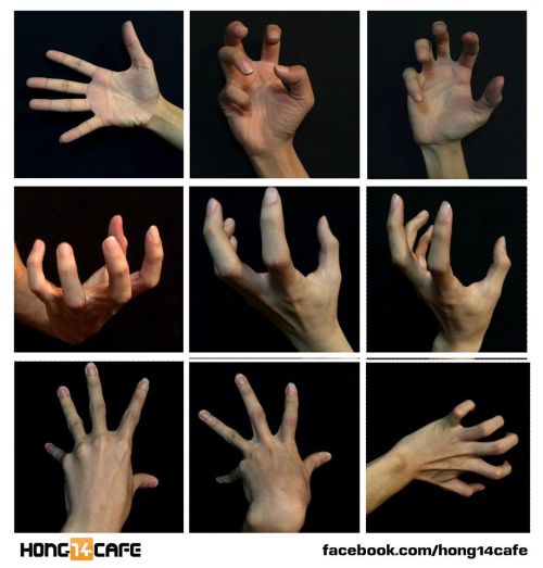
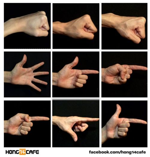
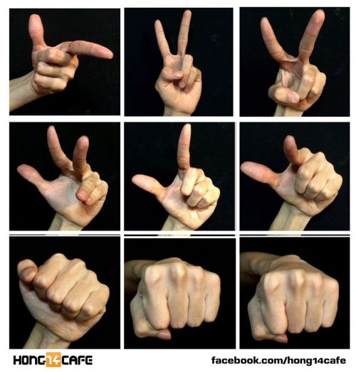
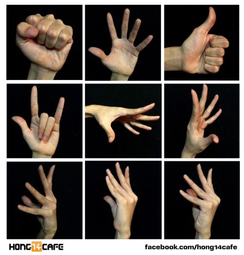
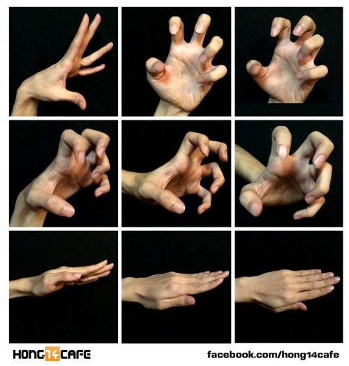
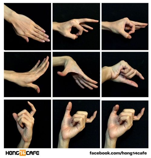
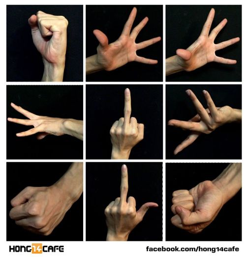
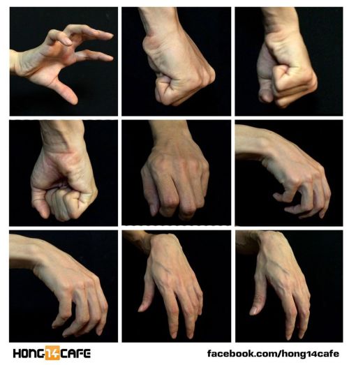
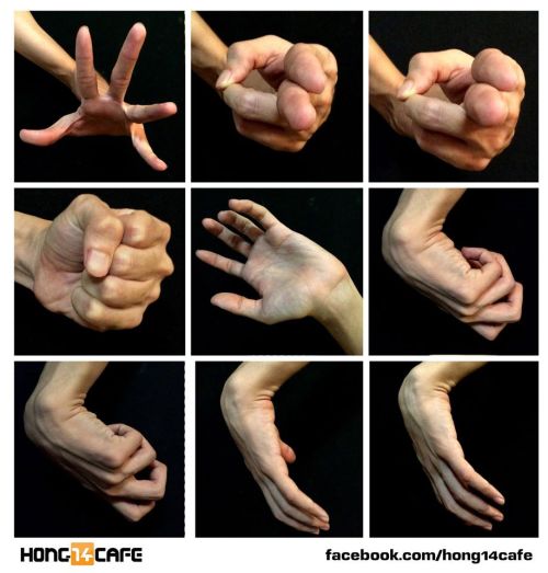
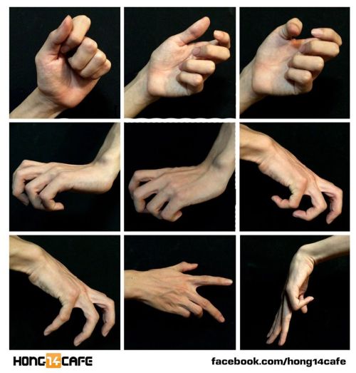
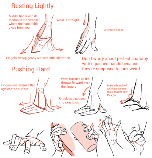
Fantastic hands references by the website Hong14cafe.
Hong14cafe: Facebook | Forum


Can you make like a little color picking tutorial, my drawings always look so out of place when i color them >.<
Okay so this is probably not the best coloring tutorial and I’m sorry ahead of time because I’m not the best at explaining colors nor am I any expert lol. I don’t actually use color palettes but I highly recommend them, esp to keep a whole artwork consistent with color schemes. You can easily just google “aesthetic color palettes” or “90′s anime color palettes” which is my go to types of colors heh.
Anyway, I made an explanation/tutorial on how I usually achieve the colors on my art. There are plenty of other ways but this is some basics on filtering.


And after that, if I’m not satisfied with the colors I just go to Filter -> and adjust the Hue of the opacity or the multiply layer.
Once I’m satisfied, I just merge all the layers and clean the art up, sometimes I add even more colors and blend them. (This probably deserves an explanation on it’s own but I wouldn’t mind explaining how I paint! ><)
And here’s somewhat of the finished art lol;;; (sweats)

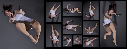
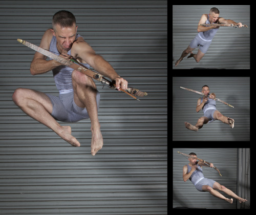
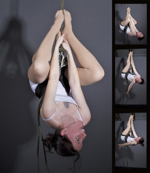
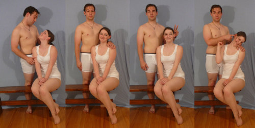
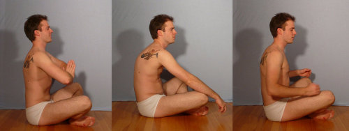
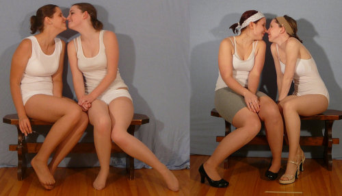
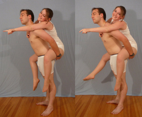
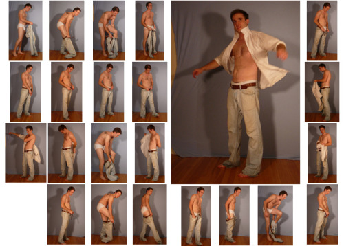
SenshiStock’s gallery consists of millions of pictures that are free to use as reference.
General Drawing Poses Sit and Kneel Dramatic and Reaching Drawing Poses Magic and Hogwarts Drawing Poses Staff Weapon Pose Reference Hammer, Axe and Bat Pose Reference Sword Weapon Drawing Reference Small Bladed Weapon Pose Reference Gun Weapon Pose Reference Bow and Arrow Archery Stock Foreshortening and Perspective Poses Dynamic Flying Falling Action Poses Deafeated or Laying Drawing Poses Magic Crystal Magical Girl Wand Weapon Transformations and Dance Cards Back Pose Reference Pin Up Inspired Poses for Drawing Performances Poses Life in General Poses Fights and Fighting Pose Reference Leaning Poses Classic Sailor Senshi Poses Wings Sailor Moon Villains Pairs Romance or Couples Pose Reference All the Male Stock Hanging Stock Drawing Reference Three or More Groups Instruments Mirrors Whip Technobabble
-
 spacepiratej liked this · 1 month ago
 -
 dragonidpyrus12 liked this · 1 month ago
 -
 pigstopher liked this · 4 months ago
 -
 masterlord04 liked this · 5 months ago
 -
 ghostangel2000 liked this · 6 months ago
 -
 mytoonyvalentine liked this · 6 months ago
 -
 raspberryfawnlol liked this · 7 months ago
 -
 diot05 reblogged this · 8 months ago
 -
diot05 liked this · 8 months ago
-
 justkynney liked this · 9 months ago
 -
 diino8081 liked this · 10 months ago
 -
 small-moons liked this · 10 months ago
 -
 uncanny-dedp00l liked this · 10 months ago
 -
 bookmarksjustforme reblogged this · 10 months ago
 -
 sunn-mechanic reblogged this · 10 months ago
 -
 wikithewikipedia reblogged this · 10 months ago
 -
wikithewikipedia liked this · 10 months ago
-
 jaybird-baby-boy reblogged this · 10 months ago
 -
jaybird-baby-boy liked this · 10 months ago
-
 existentialcanadian liked this · 10 months ago
 -
 basicallyjaywalker reblogged this · 10 months ago
 -
 basically-jay-walker liked this · 10 months ago
 -
 officercooks reblogged this · 10 months ago
 -
officercooks liked this · 10 months ago
-
 theundeadmemelord liked this · 10 months ago
 -
 dotdotdotpng reblogged this · 1 year ago
 -
dotdotdotpng liked this · 1 year ago
-
 teenart1108 liked this · 1 year ago
 -
 wrstudio-br liked this · 1 year ago
 -
 memento-mariii liked this · 1 year ago
 -
 dumbify1 reblogged this · 1 year ago
 -
dumbify1 liked this · 1 year ago
-
 cortomaltese21 liked this · 1 year ago
 -
 glamourooze liked this · 1 year ago
 -
 atsume-no-nettie liked this · 1 year ago
 -
 twadi-gurl reblogged this · 2 years ago
 -
 529hc liked this · 2 years ago
 -
twadi-gurl reblogged this · 2 years ago
-
 rightnowitssonic reblogged this · 2 years ago
 -
 kikikakapo liked this · 2 years ago
 -
 what-an-animated-world liked this · 2 years ago
 -
 fawkary liked this · 2 years ago
 -
 geofdarrow liked this · 2 years ago
